Role
UI/UX Designer
Type
App Design
Year
2024
Movietix is a mobile ticketing app concept designed to enhance user engagement through a rewards system. The app transforms routine ticket purchases into a more interactive experience, allowing users to earn points for actions. The project explored how small interactions could build long-term user loyalty and add value beyond ticket transactions
The Problem
Most ticketing apps feel transactional. Users buy a ticket, then leave. There’s little reason to return or engage further.
The Solution
Create a rewarding experience that encourages ongoing interaction through points, challenges, and social engagement.
The analysis showed that while traditional cinema apps (Event Cinemas, HOYTS) focus on transactions and loyalty programs, they lack ongoing engagement. Meanwhile, platforms like Netflix and BookMyShow succeed through personalization and continuous interaction. This gap highlighted the opportunity for Movietix to merge the convenience of ticketing with the engagement of a reward-driven experience.
Created a user journey map and user persona to uncover key user needs, frustrations, and pain points throughout the movie-booking experience. These tools helped identify where users felt confused, overwhelmed, or slowed down, guiding clearer design decisions.
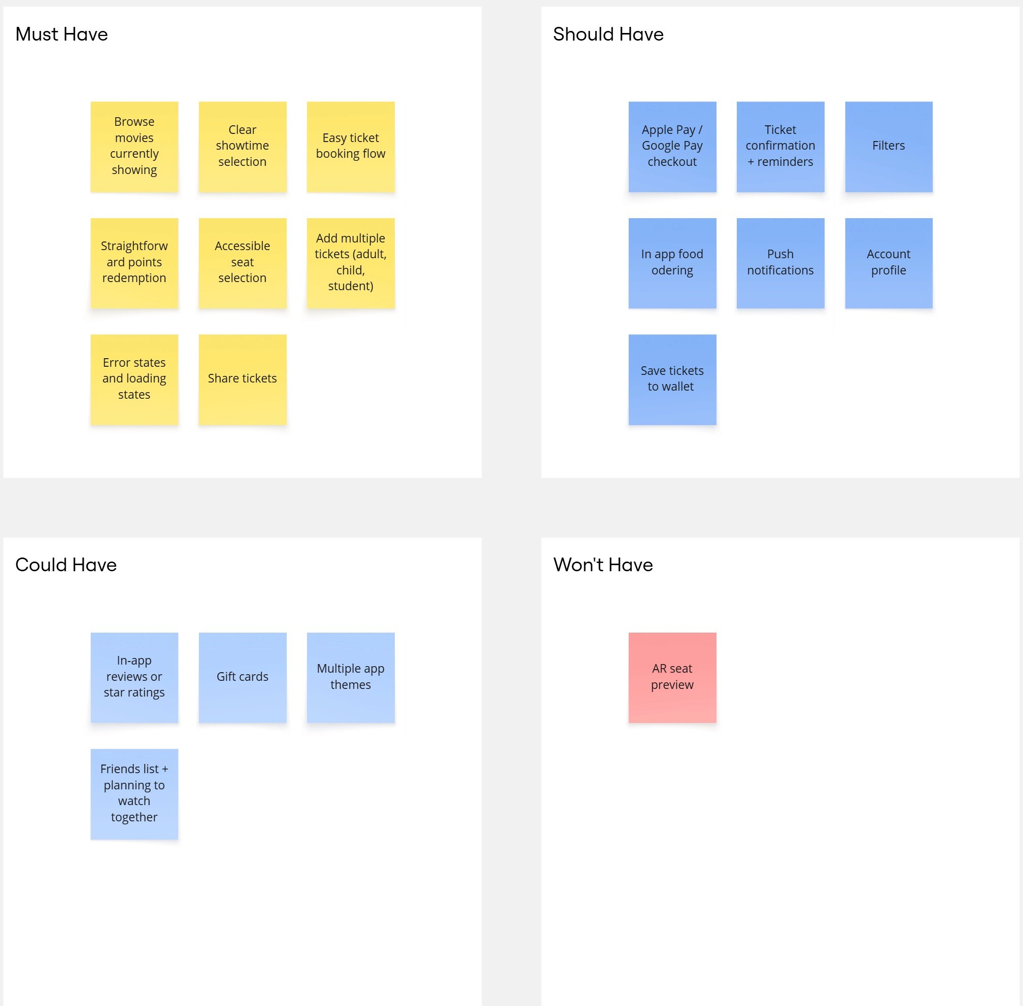
We used the MoSCoW method to clearly prioritise features for the movie ticketing app, helping us separate what users need right now from what can wait until later releases.
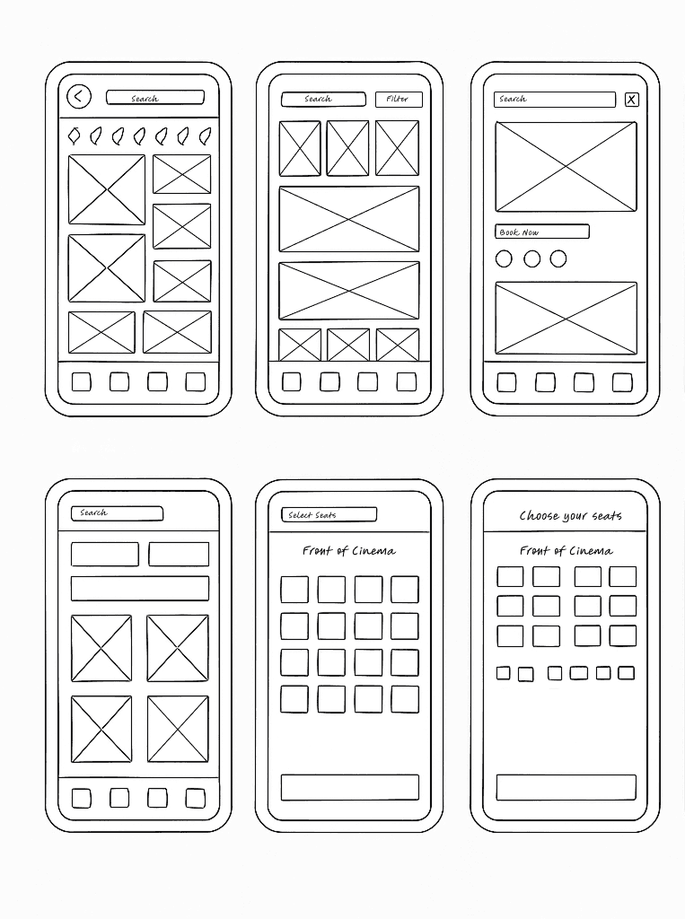
These sketches are very rough early explorations, capturing only a portion of the initial concepts created during the planning process.
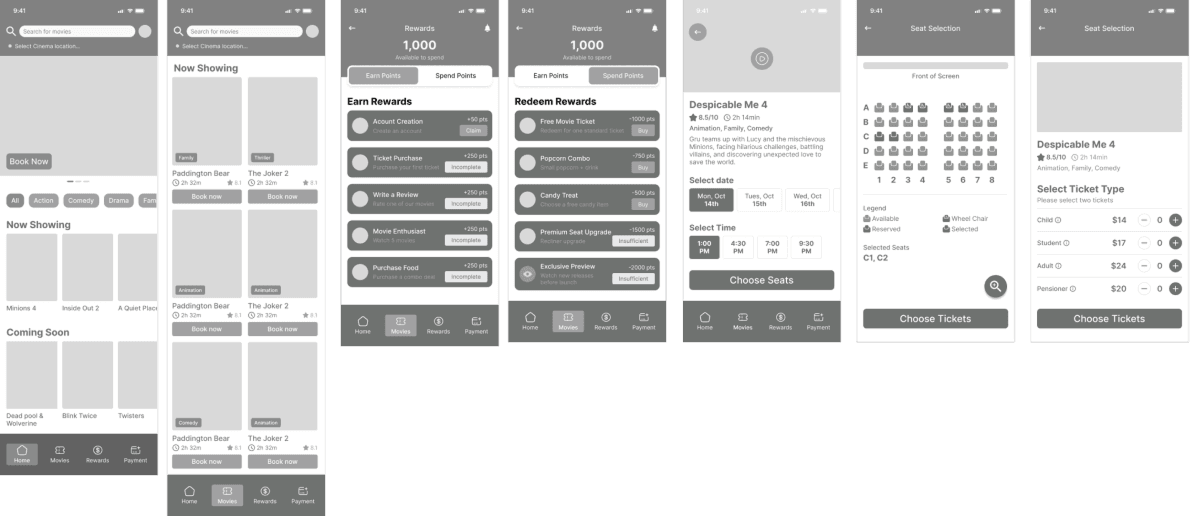
These screens represent some of the initial low fidelity mock-ups created to map out the core flows of the app. They helped shape the early structure, test layout ideas, and establish how key features might work.
Conducted a user testing session with low fidelity mock ups to validate the design decisions
and identify areas of improvement.
8
Participants
30min
Session Time
5
Total Tasks
Seat selection clarity needs improvement
Some users said the seat map felt too small and hard to tap accurately, while others felt it was fine. This inconsistency showed the need to refine sizing, spacing, and overall visibility to ensure the interaction feels effortless for everyone.
Points value was unclear
Users struggled to understand how many reward points a movie ticket was worth. The connection between actions, points earned, and redemption wasn’t immediately obvious, leading to confusion about the benefits of the rewards system.
Too many “Book Now” buttons on the movies screen
Participants felt overwhelmed by the number of “Book Now” CTAs shown at once. The repetition created visual noise and made the screen feel cluttered, suggesting the need to either consolidate actions or simplify the hierarchy.